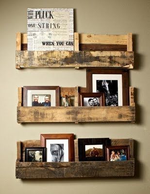
When it comes to elevating the look of a hallway, it’s essential to get creative and mix things up. Each person is going to have a unique take on what’s beautiful and what is going to help increase the aesthetics of their hallway.
This is why it’s important to go through a wide array of visual ideas to learn more about what is good and what is not.
Here are three photo and art display ideas for hallways that will resonate with you and look great as soon as they are set up.

1. Thematic Words and Photos
It’s important to think about setting a theme when it comes to the overall elegance of a wall. This is how you are going to mix things up.
The idea here is to add theme words such as “Family” or Love” to the wall along with the photos that are framed. It is about creating a well-rounded design that is going to scream elegance and it is also going to personalize the look a little bit.
You will cherish this because the words are going to be just as important as the photos that are on the wall. It is going to allow the rest of the hallway to look elegant and that is what it is all about at the end of the day.
If you want the hallway to be gorgeous, you will appreciate these theme words.
Also Read: Wall Art for The Basement
2. Frames Within A Frame
This is one of those unique ideas that can be well-done as long as you go into the process with a plan. The idea behind the frames within a frame concept is to look at creating one large frame out of smaller frames. In essence, you are going to start hanging multiple similar-sized frames on the wall. They are going to remain close to each other.
As you start to create the rectangle on the wall, it is going to turn into one big frame that is made out of those frames.
You will have to make sure things are lined up the right way while doing this but it is going to be easy on the eyes when done right. You can choose between a metal frame or wood depending on the look you are going for, just make sure that the frame type doesn’t take away from the photo or art.
It will also let the hallway pop a bit because as a person walks close to the frames, they will start to notice the individual photos.
3. Central Frame With Smaller Frames
This is a specific look where you are going to have what is known as the centerpiece of the design. This is where you are going to have one frame that will hang in the middle and it will be twice or thrice as big as the other frames.
This is going to be where the eye is going to go and then the rest of the photos will bring everything together creating a beautiful visual.
It has to be done well and it can resonate with those who have loads of photos to add to the hallway and want to make the most of the space while still having a centerpiece.
Final Thoughts
It is these photo and art displays that are going to elevate the space and make the hallway pop a bit. You should look to make the most of it and ensure you are getting the type of look that will speak volumes about the quality you are going for. You will want to make sure the display is done in a way that is going to accentuate what the hallway should look like.
If you do this, you are going to appreciate its beauty and it is going to stand out. This is what you will want to aim for.